Delivering CSS
Get a page its CSS fast: one big file or many, media attributes, why @import is slow, inlining critical CSS, and loading the rest without blocking.
- 01Choose how to split a site's CSSWeigh one big file against small files per page: bytes on the first visit, and a round trip for each new file.
- 02Keep CSS the screen doesn't need out of the wayUse media attributes so print and wide-screen styles don't hold the first paint, and replace @import with link tags.
- 03Inline critical CSS and load the rest safelyInline the first screen's rules, load the rest with the media swap or the preload swap, and avoid the flash and the CSP trap.
A page that waits for the whole shop's styles
Meera has finished her new design for Leaf and Kettle. It isn't only the mint tea page any more. She drew the home page, the tea list, the cart, the checkout, the blog, and many more. Ravi put all of their styles in one file, site.css. Every page links it.
Then Ravi opens the mint tea page on a phone like Asha's. The screen stays white for a second and a half. The page only uses a tiny part of site.css. So Ravi wonders. Why does the page wait for the styles of pages Asha isn't even on? And how can it get its own styles sooner?
The course loaded the page in Chrome 157, set up like Asha's phone, as in the font lessons. That means a phone's screen, DevTools' Slow 4G network, and a CPU 4 times slower. It tried ten ways to deliver the CSS. Here are three of them:
- one big file for the whole site;
- the page's own styles, in two small files;
- the rules the first screen needs, inside the HTML itself.
// When the mint tea page first appeared on Asha's screen, in ms after she opened it.// Each way was loaded three times. These are the loads in the middle.const firstPaint = { "one big site.css": 1499, "two small files": 1291, "critical CSS in the HTML": 703,}; for (const [way, ms] of Object.entries(firstPaint)) { console.log(`${way}: ${ms} ms`);}- Lines 1 and 2 are comments. Times are in milliseconds (ms) after Asha opened the page. Each way was loaded three times. These times come from the load in the middle.
- Lines 4 to 6 hold one way each. The number is the moment the page first appeared on the screen. That moment is the first paint.
- Lines 9 to 11 print one line per way:
one big site.css: 1499 ms,two small files: 1291 msandcritical CSS in the HTML: 703 ms.
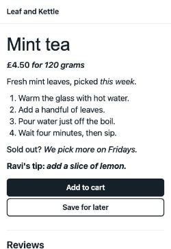
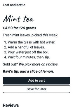
Same page, same words, same phone. Only the way the CSS arrived changed. The slowest way kept Asha's screen blank more than twice as long as the fastest. Here is what she saw:
Look at the middle column. At 1,291 ms, the page with two small files was up. The page with one big file was still blank. It was waiting for the rest of site.css. Its first paint came 208 ms later.
Now look at the left column. At 703 ms, only one screen had anything on it. That page didn't wait for a stylesheet at all. The rules for its first screen came inside the HTML.
You want to make mint tea, and a friend offers to send you the recipe. She posts her whole cookbook. You can't start until the heavy parcel arrives, though you need one page. Next week you want to bake bread. The book is already on your shelf, so you start at once.
- In real life: The whole cookbook
- In CSS: site.css: every page's styles in one file
- In real life: The one page you need tonight
- In CSS: The mint tea page's own rules
- In real life: Waiting for the heavy parcel
- In CSS: A blank screen while site.css downloads
- In real life: The book on your shelf next week
- In CSS: site.css in the browser's cache, for the next page
The first paint waits for every stylesheet in the head, whole. So send the first screen only what it needs, as early as you can. Load everything else in a way that doesn't make the paint wait.
Why does the page wait at all? Lesson 5.3 showed the reason. A stylesheet in the head is render-blocking: the browser won't paint until it has arrived. The HTML standard makes it a rule. The parser is the part of the browser that reads the HTML. A stylesheet the parser finds blocks rendering, as long as its media matches the screen. The rule doesn't say "as long as the page uses it". The browser can't know which rules apply until it has read the whole file.
The rest of the lesson takes Ravi's question one step at a time:
- One file or many? One big file against small files per page.
- What about styles for other screens? Media attributes on stylesheets.
- Why is @import slow? Files that name other files.
- Can the first screen skip the wait? Inlining critical CSS.
- How does the rest arrive? Loading CSS without blocking.
For the same ideas without a stopwatch, see The critical rendering path in the system design course.
One big file or many small files
Start with the bytes. How much of site.css does the mint tea page really use? Ravi's styles fall into three groups:
base.css: what every page shares. That's the fonts, the header, the heading, the text, the buttons and the footer.mint-tea.css: what only a tea's own page uses, like this one. That's the price, the steps and the reviews.- Everything else: the tea list and 16 other kinds of page, the layout for wide screens, and the styles for printing.
site.css is all three groups in one file. The page with two small files links only the first two.
// The CSS the mint tea page waited for, in bytes: sent (compressed) and unpacked.const siteCss = { sent: 40331, unpacked: 360192 };const twoFiles = { sent: 418 + 298, unpacked: 1171 + 888 };const share = (twoFiles.unpacked / siteCss.unpacked) * 100; console.log(`site.css: ${siteCss.sent} bytes sent, ${siteCss.unpacked} unpacked`);console.log(`base.css and mint-tea.css: ${twoFiles.sent} bytes sent, ${twoFiles.unpacked} unpacked`);console.log(`The page's own rules are ${share.toFixed(1)}% of site.css`);- Line 1 is a comment. Servers compress text before they send it, as lesson 16.1 showed. "Sent" is the size on the network. "Unpacked" is the size once the browser has undone the compression.
- Line 2 is
site.css. Line 3 adds up the two small files. - Line 4 works out what share of site.css the page's own rules are.
- Lines 6 to 8 print
site.css: 40331 bytes sent, 360192 unpackedandbase.css and mint-tea.css: 716 bytes sent, 2059 unpacked. Then they printThe page's own rules are 0.6% of site.css.
So more than 99% of site.css was for other pages, other screens, or paper. Asha's phone still downloaded all of it before the first paint. Why it matters: you pay for a render-blocking file in full, however little of it the page uses.
Real sites ship plenty of CSS too. The HTTP Archive's Web Almanac measures millions of pages each year. In 2025, the median mobile home page, the one in the middle, used 77 KB of CSS. It asked for 8 CSS files.
A small file still waits for a trip
So should Ravi cut everything into small files? First, look at how long one small file took.
// base.css, on the page with two small files: when Chrome asked for it, and when all of it had arrived.const base = { asked: 602.3, arrived: 1179.6, bytes: 418 };const bytesPerMs = 1440000 / 8 / 1000; // Slow 4G moves 1,440 kilobits a second console.log(`Asking to arriving: ${Math.round(base.arrived - base.asked)} ms`);console.log(`Moving its bytes: about ${Math.round(base.bytes / bytesPerMs)} ms`);- Line 2 holds the recorded times for
base.csson the page with two small files, and its 418 bytes. - Line 3 is how fast Slow 4G moves bytes: 1,440 kilobits a second, which is 180 bytes a millisecond.
- Line 5 prints
Asking to arriving: 577 ms. - Line 6 prints
Moving its bytes: about 2 ms.
Almost all of the 577 ms was the trip: the request going to the server, and the answer coming back. That's latency, from lesson 4.1. On Asha's line, every file pays for that trip, however small it is.
Ravi sends a courier across town with one envelope. The trip takes forty minutes. With ten envelopes, it takes forty minutes too. The trip is the slow part, not the load. A heavy box does slow the courier down, but only a little.
- In real life: The trip across town and back
- In HTTP: The round trip to the server: about 570 ms on Slow 4G
- In real life: One envelope
- In HTTP: base.css: 418 bytes, about 2 ms to move
- In real life: A heavy box
- In HTTP: site.css: 40,331 bytes, about 224 ms more
- In real life: Ten envelopes on one trip
- In HTTP: HTTP/2 sending several files at once
site.css was the heavy box. It took 808 ms from asking to arriving. That's the same trip, plus about 224 ms to move its bytes.
Two small files didn't cost two trips, either. Chrome asked for base.css and mint-tea.css within a millisecond of each other, and they arrived 10 ms apart. HTTP/2 sends many files at once over one connection, as lesson 4.5 showed.
The next page
The choice shows on the next page Asha opens. Say she taps "All teas". The tea list links base.css and its own teas.css. The course opened it right after the mint tea page, in a new tab of the same browser. So the browser's cache held every file the mint tea page had downloaded. Lesson 15.1 showed how a file with a long cache lifetime is used again without asking the server:
// Asha taps "All teas" right after the mint tea page: the bytes that crossed the network, and the first paint in ms.const teaList = { "one big site.css": { html: 326, css: 0, firstPaint: 666 }, "two small files": { html: 338, css: 178, firstPaint: 1251 }, "critical CSS in the HTML": { html: 803, css: 0, firstPaint: 652 },}; for (const [way, page] of Object.entries(teaList)) { console.log(`${way}: ${page.html + page.css} bytes downloaded, first paint at ${page.firstPaint} ms`);}- Line 1 is a comment. Each way's tea list was loaded three times. These numbers come from the load in the middle.
- Lines 3 to 5 hold one way each: the bytes of HTML and of CSS that crossed the network, and the first paint.
- Lines 8 to 10 print one line per way. The first two are
one big site.css: 326 bytes downloaded, first paint at 666 msandtwo small files: 516 bytes downloaded, first paint at 1251 ms.
With one big file, site.css came from the cache. Resource Timing said so: 0 bytes crossed the network, and its deliveryType was "cache". The tea list needed no new CSS at all.
With two small files, base.css came from the cache too. But teas.css was new. Its 178 bytes took 579 ms to arrive: a whole trip. So the tea list painted 585 ms later than with one big file.
The third line is a preview. That tea list had its own first-screen rules inside its HTML, and site.css was already in the cache. It downloaded the most bytes of the three, and still painted first.
Why it matters: one big file costs every first visit, and a file per page costs a trip on every new kind of page. On a slow line, trips count as much as bytes, so keep the files few. Better still, the third way gets both. The rest of the lesson builds it.
Try the recorded ways yourself. Pick one to see its frames and every file it asked for:
 1,499 ms
 2,467 ms
- First paint1,499 ms
- Page in its final stylesat the first paint
- HTML586 bytes, in at 574 ms
- site.cssHighest, blocking: 594 → 1,403 ms
- caveat.woff2Highest: 1,413 → 2,452 ms
- Layout shift0
- Footer styled by the endyes
- The tea list next666 ms, 326 bytes downloaded
Each frame is one Chrome drew. The rows list every file the page asked for: its priority, whether it blocked the paint, and when it started and arrived. The last rows open the same page again, or the tea list, in the same browser, with its cache.
Media attributes: styles this screen doesn't need
site.css also holds two kinds of style that Asha's phone never uses on its screen:
- The layout for wide screens. It only applies at 900 px and wider. Asha's phone is 412 px wide.
- The print styles, for when someone prints the page.
Lesson 5.3 met the media attribute. It says when a stylesheet applies. A media query is the condition inside it, like print or (min-width: 900px). So Ravi moves those styles into two files of their own, and links them with media attributes:
<link rel="stylesheet" href="base.css"><link rel="stylesheet" href="mint-tea.css"><link rel="stylesheet" href="wide.css" media="(min-width: 900px)"><link rel="stylesheet" href="print.css" media="print">- Lines 1 and 2 link the two small files from before. They have no media attribute, so they apply everywhere.
- Line 3 links
wide.cssfor screens at least 900 px wide. - Line 4 links
print.cssfor printing.
The HTML standard calls the media attribute "prescriptive" for a stylesheet. The browser must apply the file when its media matches the screen, and must not apply it when it doesn't. Chrome checks the media before it asks for the file. Recall from lesson 5.4 that Chrome gives every request a priority, from Highest to Lowest. Chromium's own code says what happens next: "Load stylesheets that are not needed for the layout immediately with low priority."
The file still downloads, so it's ready if Asha prints the page or the window grows wider. But the paint doesn't wait for it.
The shop gets four parcels in the morning. Two are labelled "for the window display" on the outside. Two are labelled "for the paper flyers". The owner opens the doors once the window parcels are in. But one day, a parcel comes with no label. There might be a note inside, but she'd have to open the box to find it. So she waits for that parcel too.
- In real life: The label on the outside
- In HTML: The media attribute on the link tag
- In real life: Parcels for the window display
- In HTML: Stylesheets whose media matches the screen
- In real life: Parcels for the paper flyers
- In HTML: media="print", or a screen size this screen isn't
- In real life: A note hidden inside the box
- In HTML: Rules wrapped in @media inside the file
A media query inside the file is too late
Some sites put the condition inside the file instead. Their print.css starts like this, and its link tag has no media attribute:
@media print { header, footer, button, .more { display: none; } body { color: #000; background: #fff; }- Line 1 opens an
@media printblock. Every rule inside it applies only on paper. - Lines 2 and 3 are the first two print rules. They hide the header, the buttons and the footer, and make the text black.
On the screen, these rules change nothing. But the browser can't know that from the link tag. It would have to download and read the file to find out. So it treats the file like any other stylesheet: it waits.
The course loaded the page both ways. Only the link tags were different:
// What Chrome reported on Asha's phone, 412 px wide: each file's priority, and whether it blocked the paint.const withMedia = { "wide.css": ["Lowest", "non-blocking"], "print.css": ["Lowest", "non-blocking"] };const withoutMedia = { "wide.css": ["Highest", "blocking"], "print.css": ["Highest", "blocking"] };const firstPaint = { withMedia: 1283, withoutMedia: 1344 }; for (const file of ["wide.css", "print.css"]) { console.log(`${file}: ${withMedia[file].join(", ")} with media; ${withoutMedia[file].join(", ")} without`);}console.log(`First paint: ${firstPaint.withMedia} ms with media, ${firstPaint.withoutMedia} ms without`);- Line 2 holds what Chrome reported for
wide.cssandprint.csswith media attributes. First is the priority DevTools shows. Then comesrenderBlockingStatus, the field from lesson 5.3 that says whether a file held back the paint. - Line 3 holds the same two files without media attributes, with their rules wrapped in @media inside.
- Line 4 holds each page's first paint.
- Lines 6 to 8 print one line per file. The first is
wide.css: Lowest, non-blocking with media; Highest, blocking without. - Line 9 prints
First paint: 1283 ms with media, 1344 ms without.
With media attributes, the page painted about as soon as the page with just two files. Without them, it painted 61 ms later. It had waited for 57 KB of wide-screen and print rules it never used on the screen.
On a laptop 1,280 px wide, wide.css would match, get Highest, and hold the paint. There, the first paint needs it.
Why it matters: a media attribute tells the browser that a stylesheet can wait, before anything downloads. Put it on the link tag, not only inside the file.
Try it in your own browser. Type a media query, or pick one. The playground asks your browser whether it matches right now:
- StatusChecking this browser
This runs in your own browser, and updates when your window changes. It asks the browser the same question it asks before it waits for a stylesheet: does this media match the screen right now?
Why @import makes the page wait longer
A stylesheet can pull in another one with an @import line. Lesson 5.3 timed a chain of three on a fast line. It was like a treasure hunt: each clue tells you where the next one is hidden. Here is the same idea on Asha's phone. Ravi's base.css now starts by importing the mint tea page's own file:
@import url("mint-tea.css");@font-face { font-family: "Caveat"; src: url("caveat.woff2") format("woff2"); font-display: swap;}- Line 1 is the
@import. It namesmint-tea.css. - Lines 2 to 6 are the first rule of base.css, as before: Caveat's font face.
The HTML links only base.css. So the page gets the same two files as before, and the same CSS. Only the way Chrome finds the second file has changed:
// The @import page: when Chrome asked for each file, and when it arrived, in ms.const files = { "base.css": [602.7, 1180], "mint-tea.css": [1181.8, 1765.5],};const firstPaint = { importChain: 1865, twoLinks: 1291 }; for (const [file, [asked, arrived]] of Object.entries(files)) { console.log(`${file}: asked at ${asked} ms, arrived at ${arrived} ms`);}console.log(`The chain cost the first paint ${firstPaint.importChain - firstPaint.twoLinks} ms`);- Lines 2 to 5 hold when Chrome asked for each file, and when it arrived.
- Line 6 holds the first paint of this page, and of the page with two link tags.
- Lines 8 to 10 print
base.css: asked at 602.7 ms, arrived at 1180 msandmint-tea.css: asked at 1181.8 ms, arrived at 1765.5 ms. - Line 11 prints
The chain cost the first paint 574 ms.
Chrome asked for mint-tea.css 1.8 ms after base.css arrived. It couldn't ask sooner. The import was inside base.css. The preload scanner, which reads ahead in the HTML for files to fetch, never reads CSS. Lesson 5.2 showed it.
And the paint waited for both. The HTML standard has the browser wait for a stylesheet's "critical subresources" before the stylesheet counts as loaded. Here, that meant the file it imports. The first paint came 100 ms after mint-tea.css arrived. That's one whole trip more than with two link tags: 574 ms on Asha's line.
Two rules for @import
If you do use @import, the CSS Cascade spec has two rules worth knowing. The first is about where it goes.
The spec says that "Any @import rules must precede all other valid at-rules and style rules", apart from a few exceptions. An @import after a normal rule is invalid, and the browser ignores it. Second, it can carry conditions, like a link tag's media:
@import url("print.css") print;
@import url("wide.css") (min-width: 900px);
@import url("grid.css") supports(display: grid);- Line 1 applies
print.cssonly on paper. - Line 2 applies
wide.cssonly on screens 900 px and wider. - Line 3 applies
grid.cssonly in a browser that supportsdisplay: grid.
The spec lets a browser skip downloading an import while its conditions don't match. If a supports() condition doesn't match, it must not download the file at all. But an import that does match is still found late, after the file that names it.
Why it matters: every @import in a render-blocking stylesheet adds a trip before the first paint. Link each stylesheet from the HTML instead.
Inlining critical CSS, and what it costs
Back to the fastest way from the start. Lesson 17.4 met it. You put the critical CSS, the rules the first screen needs, straight into the HTML, in a <style> tag. web.dev describes it as a technique that "extracts the CSS for above-the-fold content". Above the fold means what a visitor sees before scrolling.
On Asha's phone, the first screen shows the header, the heading, the price, the steps, both buttons and the top of the reviews. Ravi picked the rules for those: 23 in all. Here is the head of the page, with the rules themselves left out:
<style> /* The 23 rules the first screen needs */</style><link rel="stylesheet" href="site.css" media="print" onload="this.media='all'"><noscript><link rel="stylesheet" href="site.css"></noscript>- Lines 1 to 3 are the style tag. Its rules arrive with the HTML, so there's no file to wait for.
- Line 4 loads all of
site.csswithout holding the paint. The next section explains how. - Line 5 is for browsers with JavaScript turned off. The next section explains it too.
The HTML arrived at 582 ms, and the page painted at 703 ms. There was no stylesheet in between. Even Caveat started sooner, at 617 ms instead of 1,193 ms, because its @font-face rule came with the HTML.
Leaf and Kettle prints the brewing steps on every box of mint tea. You can make a cup the moment the box arrives, with no book to wait for. But every box carries the print, so the shop pays for the ink every time. A cookbook is different. You buy it once, and keep it on the shelf.
- In real life: The steps printed on the box
- In CSS: Critical CSS in a style tag in the HTML
- In real life: Brewing the moment the box arrives
- In CSS: The first paint, with no stylesheet to wait for
- In real life: Ink on every single box
- In CSS: The same bytes in every page's HTML, on every visit
- In real life: The cookbook on the shelf
- In CSS: A stylesheet file, kept in the cache
What it costs on every visit
A style tag is part of the HTML. Ravi's server sends its HTML with Cache-Control: no-cache, so the browser asks for it again on every visit. Lesson 15.1 met this header. So the inline CSS comes again every time too. web.dev warns that inlining "prevents the browser from caching the CSS for reuse on subsequent page loads, so it's best to use it sparingly."
So what does that cost Asha when she comes back? The course opened each page again, in a new tab of the same browser, with its cache. It also tried the other end: all of site.css in a style tag.
// The mint tea page, opened again in a new tab: the bytes that crossed the network, and the first paint in ms.const secondVisit = { "two small files": { html: 616, css: 0, firstPaint: 709 }, "critical CSS inline": { html: 1116, css: 0, firstPaint: 684 }, "all of site.css inline": { html: 40974, css: 0, firstPaint: 905 },}; for (const [way, visit] of Object.entries(secondVisit)) { console.log(`${way}: ${visit.html + visit.css} bytes downloaded, first paint at ${visit.firstPaint} ms`);}- Line 1 is a comment. Each page was opened again three times. These numbers come from the visit in the middle.
- Lines 3 to 5 hold one way each: the bytes of HTML and of CSS that crossed the network, and the first paint.
- Lines 8 to 10 print
two small files: 616 bytes downloaded, first paint at 709 msandcritical CSS inline: 1116 bytes downloaded, first paint at 684 ms. Then they printall of site.css inline: 40974 bytes downloaded, first paint at 905 ms.
The page with two small files took both stylesheets from the cache. It downloaded only its HTML. The critical CSS page downloaded its inline rules again: 500 bytes more, about 3 ms on Asha's line. Both pages painted at about the same time. The 25 ms between them is less than the spread between three visits to the same page: 66 ms for the critical CSS page.
So Ravi's small inline CSS costs a few bytes on every visit, but no time you could measure. In return, the first visit painted 588 ms sooner.
All of site.css inline was a different story. On the first visit, its 40,974 bytes of HTML arrived at 805 ms, against 582 ms for the critical CSS page. It painted at 925 ms. And the second visit downloaded all 40,974 bytes again. It painted at 905 ms, 221 ms after the critical CSS page.
Why it matters: inline only what the first screen needs. Everything else belongs in a file the browser can cache.
How small is small?
web.dev suggests keeping the first screen's content under 14 KB, compressed. Lesson 4.3 showed why. A new connection starts slowly, and its first round trip carries about 14 KB. If the HTML and its inline CSS fit in that, the first screen can arrive in one trip. Move the slider to see what a size costs on every visit:
- Inline CSS in every page's HTML500 bytes, compressed
- Moving it on Slow 4G, on every visitabout 3 ms
- In 10 visits, downloaded5,000 bytes
- As a cached file instead500 bytes once, then from the cache
- web.dev's 14 KB guideunder 14 KB, with room for the HTML
The lab divides the bytes by Slow 4G's speed, 1,440 kilobits a second. It leaves out the time to read the CSS, so a real page pays a little more.
Tools that find the critical rules
Picking rules by hand is slow, and easy to get wrong. Tools do it when you build the site:
- Critical has two ways to decide. Its static engine matches every rule against the page's HTML, with no browser. Its render engine opens the page in a real browser, at the screen size you choose. It keeps the rules for what it paints above the fold.
- Beasties carries on Critters, a tool from Google Chrome Labs that is now archived. It "doesn't use a headless browser". It inlines "all CSS rules used by your document, rather than only those needed for above-the-fold content".
Both put the rules in a style tag, and change the link tags so the rest loads without blocking. Run them again whenever the CSS or the page changes. Otherwise the inline rules and the page drift apart.
Loading the rest of the CSS without blocking
The critical rules paint the first screen. The rest, like the footer, still has to load, and Ravi wants site.css in the cache for the next page. But it mustn't hold the paint.
A script tag has async for that. A link tag has nothing like it. Instead, there are two tricks:
<link rel="stylesheet" href="site.css" media="print" onload="this.media='all'">
<link rel="preload" href="site.css" as="style" onload="this.onload=null;this.rel='stylesheet'">- Line 1 is the media swap, from Filament Group.
media="print"doesn't match the screen, so the browser downloadssite.cssat Lowest, without blocking.onloadis a bit of JavaScript in the tag. It runs when the file has loaded, and sets the media toall. Then the rules apply. - Line 2 is the preload swap, from web.dev, which lesson 17.4 used.
rel="preload"downloads the file without applying it. When it has loaded,onloadturns the link into a stylesheet. Settingonloadtonullfirst stops some browsers from running it twice.
The course recorded both, each with the critical CSS inline:
// site.css on the two critical CSS pages: its priority, when it arrived, and when its onload switched it on, in ms.const mediaSwap = { priority: "Lowest", arrived: 1556.7, applied: 1566.5 };const preloadSwap = { priority: "Highest", arrived: 1603.7, applied: 1611.5 }; for (const [name, file] of Object.entries({ mediaSwap, preloadSwap })) { console.log(`${name}: ${file.priority}, arrived at ${file.arrived} ms, applied at ${file.applied} ms`);}- Line 2 holds the media swap's
site.css: its priority, when it arrived, and whenonloadswitched it on. - Line 3 holds the same for the preload swap.
- Lines 5 to 7 print
mediaSwap: Lowest, arrived at 1556.7 ms, applied at 1566.5 msandpreloadSwap: Highest, arrived at 1603.7 ms, applied at 1611.5 ms.
Both pages painted at 703 ms. Then site.css applied, less than a second later. It only changed things below the first screen, so Asha saw nothing move.
The two tricks differ in one way: priority. Filament Group warns that preload fetches files "at the highest priority, potentially deprioritizing other important downloads". On Ravi's page, the priority made no clear difference. In every load, site.css arrived between 1,557 and 1,622 ms either way. On a busier page, a Highest request competes with the files the first screen needs. The media swap keeps site.css out of their way.
The <noscript> tag in Ravi's head is the fallback. Without JavaScript, onload never runs. A browser with scripting turned off reads what's inside <noscript>, and loads site.css as a normal stylesheet.
Deferring everything: the flash
Why not skip the critical CSS, and load all of site.css with the media swap? The course tried that too:
// The page with the media swap and nothing inline, in ms after Asha opened it.const firstPaint = 700; // the first frame: the page without its stylesconst styled = 1477; // the first frame with its stylesconst layoutShift = 0.3265; console.log(`Unstyled for ${styled - firstPaint} ms`);console.log(`Layout shift when the styles arrived: ${layoutShift}`);- Line 2 is the first frame with anything on the screen.
- Line 3 is the first frame with the page's styles.
- Line 4 is the layout shift Chrome reported when the styles arrived. That's its score for how much of the page moved on its own.
- Lines 6 and 7 print
Unstyled for 777 msandLayout shift when the styles arrived: 0.3265.
Nothing blocked the paint, so the page appeared at 700 ms. But it had no styles. Asha saw the browser's plain black text on white, with small grey buttons. Then site.css arrived, and everything jumped. That's the flash of unstyled content from lesson 5.3.
At a theatre, the curtain stays shut while the crew sets the stage. If it opened early, the audience would see bare boards, then furniture rushing into place. A good crew sets the front of the stage first. Then the curtain can rise while they finish at the back.
- In real life: Opening the curtain
- In CSS: The first paint
- In real life: Bare boards, then furniture rushing in
- In CSS: The page without styles, then the jump
- In real life: Setting the front of the stage first
- In CSS: Critical CSS for the first screen, inline
- In real life: Finishing at the back
- In CSS: site.css applying below the first screen
The jump cost more than a moment of mess. Chrome counted it as one layout shift, worth 0.3265. CLS, Cumulative Layout Shift, adds up the worst burst of shifts. In lesson 3.1, a CLS of 0.1 or less was good. One late stylesheet gave this page more than three times that.
Why it matters: put off the CSS the first screen doesn't need, never the CSS it does.
When onload never runs
Both tricks rely on an onload attribute. That's JavaScript written inside the HTML. Many sites send a Content Security Policy: a header that tells the browser which scripts may run. A strict one blocks inline handlers like onload. MDN says it plainly: "inline event handlers are blocked as well". The course sent the critical CSS page with this header:
Content-Security-Policy: script-src 'self'It lets scripts run from the site's own files, and nothing written inline. The page still painted at 699 ms, thanks to its critical CSS. site.css arrived at 1,618 ms. But onload never ran. When the recorder stopped watching, the link still said media="print". The footer had none of its styles. The noscript fallback didn't help, because JavaScript was on.
With a strict policy, use a way without inline handlers. Critical, for example, keeps a preload in the head and moves the stylesheet link to the end of the body. Its README says this works "under a strict script-src Content Security Policy".
Here are six of the recorded ways side by side. Read each row across: how the CSS arrived, when the page first appeared, and what to watch for.
| How the CSS arrives | First paint | What to watch for |
|---|---|---|
| One big site.css in the head | 1,499 ms. | The whole site's CSS, 40,331 bytes, before anything shows. |
| Two small files in the head | 1,291 ms. | Each new kind of page needs a file of its own: the tea list painted at 1,251 ms. |
| base.css with @import | 1,865 ms. | The second file starts only when the first has arrived. |
| Critical CSS inline, site.css by media swap | 703 ms. | The inline rules must cover the whole first screen. |
| Media swap, nothing inline | 700 ms, unstyled. | The page flashes without styles, then everything moves. |
| All of site.css inline | 925 ms. | 40,974 bytes of HTML on every visit, never cached. |
Ravi picks the critical CSS row, with the media swap. The first screen paints in about 700 ms. And site.css still downloads, so the tea list took it from the cache and painted at 652 ms.
Where should this CSS go?
For each piece of CSS, ask one question: does the first screen need it? Then sort it:
- The header, the heading and the price on a product page
- The Add to cart button, near the top
- Styles that only matter on paper
- The layout for screens 900 px and wider
- The footer at the bottom of a long page
- The checkout page's styles, on the mint tea page
Sort each piece of CSS by how it should reach the page.
Common mix-ups
- "The browser only waits for the rules the page uses." No. It waits for the whole stylesheet. The mint tea page's own rules were 0.6% of
site.css, and it waited for all of it. - "A smaller file always arrives fast." No. On Slow 4G, a 418-byte file took 577 ms. Almost all of it was the trip.
- "Rules inside @media print don't block." No. Without a media attribute on the link tag, the browser can't see inside the file. It gave the file Highest, and waited for it.
- "A print stylesheet with a media attribute isn't downloaded." No. Chrome downloads it at Lowest, so it's ready if someone prints the page.
- "@import is a tidy way to link files." No. The imported file is found only after the first one arrives. On Asha's phone, that cost 574 ms.
- "Inlining all the CSS is the fastest." No. All of
site.cssinline made 40,974 bytes of HTML on every visit, never cached. The page painted later than with only the critical rules inline. - "The media swap always works." No. Under a strict Content Security Policy,
onloadnever runs, and the stylesheet never applies.
Practice exercises
Answer each one first, then open the hints if you need them.
Ravi's site.css doubles in size. What does the last line print?
// A bigger site.css: twice the bytes.
const siteCss = { bytes: 80662 };
const bytesPerMs = 1440000 / 8 / 1000;

console.log(`Moving its bytes: about ${Math.round(siteCss.bytes / bytesPerMs)} ms`);Moving its bytes: about 448 ms. Twice the bytes take twice as long to move. The trip itself doesn't grow, so the first paint would come about 224 ms later than before.
This stylesheet never loads mint-tea.css. Which line does the browser ignore?
body { margin: 0; }
@import url("mint-tea.css");
header { height: 56px; }@import url("mint-tea.css");
body { margin: 0; }
header { height: 56px; }Line 2. An @import after a normal rule is invalid, so the browser ignores it, and mint-tea.css never loads. Move it to the top. Better still, link mint-tea.css from the HTML.
On the recorded @import page, when did Chrome ask for caveat.woff2, in ms?
1,771 ms. Chrome found Caveat's @font-face rule only once both stylesheets had arrived. So a chain of CSS files makes the font late too.
Every phone waits for wide.css before the first paint. What do you add to line 3?
<link rel="stylesheet" href="base.css">
<link rel="stylesheet" href="mint-tea.css">
<link rel="stylesheet" href="wide.css"><link rel="stylesheet" href="base.css">
<link rel="stylesheet" href="mint-tea.css">
<link rel="stylesheet" href="wide.css" media="(min-width: 900px)">media="(min-width: 900px)". On a phone the query doesn't match, so Chrome downloads wide.css at Lowest and paints without it. On a wide screen it matches, and the paint waits for it there.
In the media query playground, type print. Then use DevTools to make the page pretend it's printed. What does the row "Matches this browser now" say?
Yes. DevTools makes the page believe it's being printed, so print now matches. A stylesheet with media="print" would now apply.
Beasties can load the rest of the CSS in several ways. Which of its strategies avoids inline onload handlers, so a strict policy can allow it?
media-script. Like the media swap, but one script at the end of the body restores the media, with no inline onload. The script never changes, so a Content Security Policy can allow it by its hash.
Check your understanding
For each question, ask: does the first paint wait for this CSS, and how many trips does it take to arrive?
Question 1 of 7What does this print?
Read the code, then predict// Each file has one @import line at its top, naming the next file. const chain = ["base.css", "theme.css", "mint-tea.css"]; console.log(`Files Chrome must wait for before it can ask for mint-tea.css: ${chain.length - 1}`);Choose an answer to see the explanation.
Question 2 of 7The mint tea page links one big site.css. Why does its first paint wait for rules the page never uses?
Choose an answer to see the explanation.
Question 3 of 7On a phone 412 px wide, which of these link tags doesn't hold back the first paint?
Choose an answer to see the explanation.
Question 4 of 7In the recording, which way of delivering the CSS put the styled page on the screen first?
Choose an answer to see the explanation.
Question 5 of 7What does inlining CSS cost on a visitor's second visit?
Choose an answer to see the explanation.
Question 6 of 7A site uses the media swap, and its Content Security Policy is script-src 'self'. What happens to the stylesheet?
Choose an answer to see the explanation.
Question 7 of 7What priority does Chrome give site.css when it's loaded with rel="preload" as="style"?
Choose an answer to see the explanation.
Key takeaways
- A stylesheet in the head holds the first paint until all of it has arrived, whatever share the page uses.
- One big file slows the first visit. A file per page costs a trip on each new kind of page. Keep files few.
- A media attribute on the link tag lets non-matching CSS download at Lowest, without holding the paint.
- Each @import adds a trip before the first paint. Link stylesheets from the HTML instead.
- Inline only the first screen's rules. Inline CSS comes again on every visit; a file can be cached.
- Load the rest with the media swap or the preload swap. Never defer what the first screen needs, and watch for CSP.
Remember the one-liner.
Print the steps on the box, and keep the cookbook on the shelf: inline the first screen's CSS, and cache the rest.
Sources
The facts on this page come from these standards, docs, data and source code:
- HTML Standard: the stylesheet link type, WHATWG.
- Web Almanac 2025, Page Weight: the median page by the bytes, HTTP Archive.
- Web Almanac 2025, Page Weight: CSS request volume, HTTP Archive.
- HTML Standard: processing the media attribute, WHATWG.
- Chromium 157: link_style.cc, low priority for stylesheets whose media doesn't match, the Chromium project.
- Chromium 157: resource_fetcher.cc, the priorities of stylesheets, the Chromium project.
- PerformanceResourceTiming: renderBlockingStatus, MDN.
- CSS Cascading and Inheritance Level 5: the @import rule, W3C.
- @import, MDN.
- Extract critical CSS, web.dev.
- Critical 9.0.0: README, Addy Osmani and contributors.
- Beasties 0.5.5: README, Daniel Roe and contributors.
- Defer non-critical CSS, web.dev.
- The Simplest Way to Load CSS Asynchronously, Filament Group.
- rel=preload, MDN.
- Content-Security-Policy: script-src, MDN.
Coming next: Shipping less CSS. Ravi's site.css is still 360 KB. Next, find the CSS nobody uses, and keep the file small as the shop grows.