When to skip web fonts
What a second web font costs: system font stacks that cost nothing, how many weights a design needs, faux bold and italic, and choosing fonts with a designer.
- 01Write a system font stackUse system-ui and a generic family so the text needs no download, and know what each system draws.
- 02Count the weights a design needsKnow that each style is a file, which face a missing weight borrows, and when Chrome fakes bold and italic.
- 03Choose fonts with a designerShow the cost of each choice in bytes, files and the moment the text is final, and decide together.
A second font with four weights
Ravi's mint tea page has used Caveat since lesson 20.1. Last lesson, he gave it a fallback face: a local font, sized like Caveat, so the swap moves nothing. This week, Meera, a designer, draws the page again. She keeps Caveat for the heading. "Handwriting is lovely in a title," she says. "But it's hard to read in long text."
For the rest of the text, she picks Lora. It's a calm book font with serifs: small strokes at the ends of the letters. And she wants four weights. Lesson 20.2 met weights: how thick the letters are, from 400 for regular to 700 for bold. Meera asks for 400, 500, 600 and 700. She wants each one in italic too. Italic letters slope, and some have shapes of their own.
That's eight styles: four weights, each upright and italic. Lora comes as one file per style. So Ravi's page would send eight more files to Asha's phone. But her phone already has fonts of its own. The shop's name has used one since lesson 20.1, and the buttons since lesson 20.3. Nothing was ever downloaded for them. So Ravi wonders. What would Meera's eight files cost Asha? And could the text simply use the phone's own font?
The course loaded the page three ways in Chrome 157, set up like Asha's phone, as before. That means a phone's screen, DevTools' Slow 4G network, and a CPU 4 times slower. The heading stayed in Caveat each time. Only the text changed:
- in the phone's own font;
- in Lora, with only the regular file;
- in Lora as Meera asked, with eight files.
// Asha's phone, Slow 4G: the text's font, as recorded (ms after she opened the page)const pages = { "system font": { loraBytes: 0, wordsAt: 1265, finalAt: 1265 }, "Lora, 1 file": { loraBytes: 21148, wordsAt: 1236, finalAt: 2051 }, "Lora, 8 files": { loraBytes: 177736, wordsAt: 1232, finalAt: 2964 },}; for (const [page, { loraBytes, wordsAt, finalAt }] of Object.entries(pages)) { console.log(`${page}: ${loraBytes} bytes of Lora, words at ${wordsAt} ms, final at ${finalAt} ms`);}- Line 1 is a comment. Times are in milliseconds (ms) after Asha opened the page. Each page was loaded three times. These times come from the load in the middle.
- Lines 3 to 5 hold one page each. Each has the bytes of Lora it downloaded, when the words first appeared, and when the text took its final font.
- Line 9 prints one line per page. The first is
system font: 0 bytes of Lora, words at 1265 ms, final at 1265 ms. - The second is
Lora, 1 file: 21148 bytes of Lora, words at 1236 ms, final at 2051 ms. The third isLora, 8 files: 177736 bytes of Lora, words at 1232 ms, final at 2964 ms.
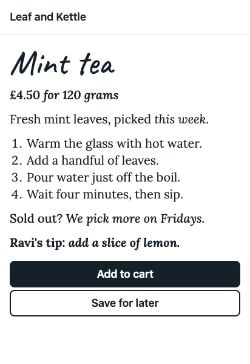
The words came at about the same moment on all three pages, a little over a second in. That's font-display: swap at work, from lesson 20.1: it shows the words at once in a font the phone has. What changed is how long the text kept changing. With the phone's own font, the text was final from the first paint, the first frame with the page on it. With Meera's eight files, it settled 1.7 seconds later. Here is what Asha saw:
Look at the heading in the bottom row. Caveat came last on every page. With the phone's font, it came at 2,238 ms. With eight Lora files, it came at 3,249 ms, about a second later. All nine font files shared the same slow line. So even Caveat, which every version had, came later.
So the eight files cost Asha twice. Her text took its final look later, and so did the heading.
Packing for a trip, you can bring your own towels. They're the ones you like. But they make the suitcase heavier, and you carry them all the way. Or you can use the hotel's towels. They're waiting in the room when you arrive. They just aren't the same in every hotel.
- In real life: Your own towels, packed in the suitcase
- In fonts: A web font, downloaded with the page
- In real life: A heavier suitcase to carry
- In fonts: More bytes and more files on a slow line
- In real life: The towels waiting in the room
- In fonts: A system font, already on the device
- In real life: Different towels in every hotel
- In fonts: A different system font on each system
A web font is a download: bytes, a request, and a wait before the text takes its final look. A system font is already on the device, so the text is final from the first paint. Use a web font where it earns its place, in only the styles the design really uses.
The rest of the lesson takes one question at a time:
- Which fonts does a device already have? System font stacks.
- How many files does a design need? How many weights you need.
- What if a file is missing? Faux bold and italic.
- How do you choose with a designer? Talking with designers about fonts.
For the same ideas without a stopwatch, see Web fonts in the system design course.
System font stacks: fonts the device already has
Every phone and computer comes with fonts. Its menus, settings and buttons use one of them. That's its system font. web.dev puts the gain simply: "Because the font is already installed, the font does not need to be downloaded."
How does a page ask for it? It can't name one font, because each system has a different one. So CSS has a name that means "the font this device uses": system-ui. The CSS Fonts spec says it "lets text render with the default user interface font". It's a generic family: a name CSS defines, which the browser turns into a font that's installed.
Ravi's page has used it all along. Here are three lines from its stylesheet:
body { font: 16px/1.4 system-ui, sans-serif; }button { font: 600 18px system-ui, sans-serif; }p, li { font-family: system-ui, sans-serif; }- Line 1 is from lesson 20.1: the page's base font. The shop's name uses it.
- Line 2 is from lesson 20.3. It gives the buttons the same font, at weight 600.
- Line 3 is new. It puts the text in the system font too: the price, the description, the steps, the note and the tip.
Each line lists two fonts. A list like that is a font stack: fonts in order of preference. The browser walks down it and uses the first font it has. sans-serif, at the end, is another generic family. Every browser has a font for it, so the list never runs out.
At a café you don't know, you ask: "Darjeeling, please. If you don't have it, Assam. If not, any black tea." The first café has Darjeeling. The second only has Assam. Every café has some black tea, so you never leave without a cup.
- In real life: Your list: Darjeeling, then Assam, then any black tea
- In CSS: The font stack in font-family
- In real life: What each café has on its shelf
- In CSS: The fonts installed on each device
- In real life: "Any black tea"
- In CSS: A generic family, like sans-serif
- In real life: The tea in your cup
- In CSS: The font that draws the text
Here is the same walk down the list, as a small model in JavaScript. It isn't the browser's own code.
// A small model: the browser takes the first font in the list that this device hasconst stack = ["system-ui", "Segoe UI", "Roboto", "sans-serif"];const oldAndroidBrowser = new Set(["Roboto", "Noto Sans", "sans-serif"]); const picked = stack.find((font) => oldAndroidBrowser.has(font));console.log(`Picked: ${picked}`);- Line 2 is the stack.
- Line 3 is the fonts an old Android browser has. It doesn't know system-ui.
- Line 5 finds the first font in the stack that the browser has. Line 6 prints
Picked: Roboto.
So which font does system-ui give? The course asked DevTools, on the Mac it recorded on. In the Elements panel, the Computed tab has a Rendered fonts section. It lists the fonts that really drew an element's text. For every part of the text on the system page, it listed .SF NS, a local file: one installed on the computer. That's San Francisco, Apple's own typeface. Apple calls its SF Pro "the system font for Apple platforms".
Other systems give other fonts. The HTTP Archive's Web Almanac lists them: San Francisco on macOS and iOS, Segoe UI on Windows, and Roboto on Android.
system-ui with its own interface font, already installed. On the Mac the course recorded on, DevTools called it .SF NS.The bold and italic parts came from the Mac's font too. DevTools listed real bold and italic faces, like .SFNS-Bold and .SFNS-RegularItalic. Apple says SF Pro "features nine weights". So the system page got all eight of Meera's styles for free.
Longer stacks, for older browsers
Older browsers didn't know system-ui, so they skipped it. That's why many sites also list the system fonts by name. Bootstrap, a popular CSS library, calls this its "native font stack":
body { font-family: system-ui, -apple-system, "Segoe UI", Roboto, "Helvetica Neue", "Noto Sans", "Liberation Sans", Arial, sans-serif, "Apple Color Emoji", "Segoe UI Emoji", "Segoe UI Symbol", "Noto Color Emoji";}- Line 2 starts with system-ui.
-apple-systemis an older name Safari used for San Francisco."Segoe UI"is for Windows, andRobotofor Android. - Line 3 adds Helvetica Neue for older Apple systems. Bootstrap lists Noto Sans and Liberation Sans for Linux. Then come Arial and the generic sans-serif.
- Line 4 lists emoji fonts, so emoji show in color.
A browser that knows system-ui stops at the first name. The rest are for browsers and systems that don't.
The ui- families
The CSS Fonts spec adds four more generic families. Each is a version of the system's own font:
ui-sans-serif: plain letters. On Apple systems, the spec's example is San Francisco.ui-serif: letters with serifs, like Apple's New York.ui-monospace: every letter the same width, like SF Mono.ui-rounded: letters with round ends, like SF Rounded.
The spec warns that they're "not expected to map to any font on platforms without an appropriate system font." Only Safari supports them. So always put another font after one. GitHub does this for code, in its design system, Primer:
code, pre { font-family: ui-monospace, SFMono-Regular, SF Mono, Menlo, Consolas, Liberation Mono, monospace;}Line 2 asks for ui-monospace first. Next come monospaced fonts by name, for each system. Last is the generic monospace.
Try the families in your own browser. The playground draws a sample in the family you pick, with monospace after it:
Fresh mint leaves, picked this week.
- What it namesThe device's user interface font.
- Found hereChecking this browser
This runs in your own browser. The sample uses the family you picked, with monospace after it. If your browser has no font for the family, it skips it, and the sample turns monospaced.
Where system-ui needs care
The spec adds a warning. Which font you get depends on the system, its language settings and the user. Some systems pick a poor font for some languages. The spec's example: "Simplified Chinese users might get a monospaced serif font on older version of Windows".
It also says system-ui "may or may not be suitable for large paragraphs of text". MDN suggests sans-serif for long paragraphs. web.dev is more hopeful: system fonts "can work particularly well for body text". For a page in another language, check the text on real devices.
Why it matters: a system font stack costs no bytes and no requests, and the text never swaps. On Asha's phone, the system page's text was final at its first paint in all three loads, between 1,250 and 1,271 ms.
How many weights you need
Meera's eight styles mean eight @font-face rules. Lesson 20.1 met these rules: each one tells the browser where a font file is. Each rule describes one face: one style of the family. Here is one of the eight:
@font-face { font-family: "Lora"; src: url("lora-latin-600-italic.woff2") format("woff2"); font-weight: 600; font-style: italic; font-display: swap;}- Lines 2 and 3 name the family and the file.
- Lines 4 and 5 say which style this file is: weight 600, in italic.
- Line 6 is the swap from lesson 20.1.
The other seven rules are the same, with another file and other numbers. web.dev says it plainly: "A font file contains a single style, unless it's a variable font." So each style is one more download.
Ravi repaints the shop's sign. The paint shop sells each shade of green in its own tin. A sign with eight shades means eight tins to carry home. Most signs look just as good with two or three.
- In real life: One tin of paint
- In fonts: One font file, holding one style
- In real life: Eight shades of green
- In fonts: Meera's eight styles
- In real life: Carrying every tin home
- In fonts: Downloading every file
- In real life: The shades the sign really uses
- In fonts: The styles the text really uses
A rule alone downloads nothing. The CSS Fonts spec says the browser must "only download those fonts that are referred to within the style rules applicable to a given page." So a file is fetched only when some text uses its style. Meera's page uses all eight, once each. So all eight came:
// Lora's eight files on Asha's phone, as recordedconst files = 8;const bytes = 177736;const firstChange = 2864;const textFinal = 2964; console.log(`${files} files, ${bytes} bytes`);console.log(`The text changed from ${firstChange} ms to ${textFinal} ms`);- Lines 2 and 3 are the files and their bytes: about eight times the one regular file.
- Line 4 is the first frame where some of the text had changed to Lora. Line 5 is the frame where the text stopped changing.
- Lines 7 and 8 print
8 files, 177736 bytesandThe text changed from 2864 ms to 2964 ms.
Each file arrived on its own, and Chrome drew the text again as each one came. So in those 100 ms, the text changed its look 7 times. Pick a page to see every frame:
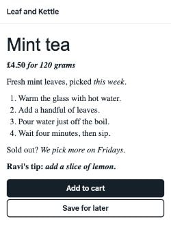 1,232 ms
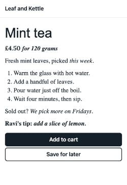 2,864 ms
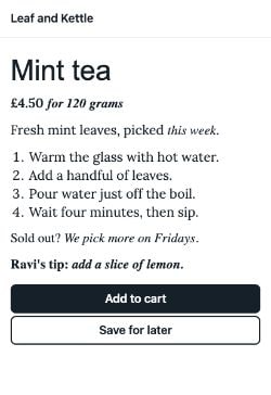 2,880 ms
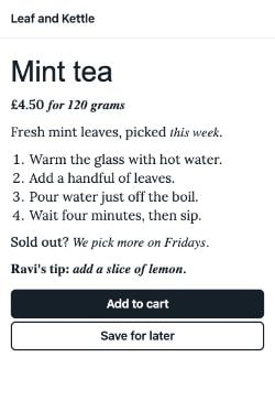 2,898 ms
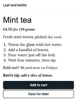 2,914 ms
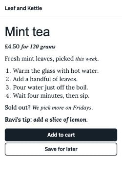 2,932 ms
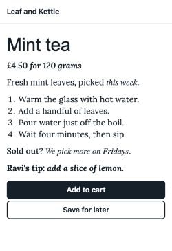 2,949 ms
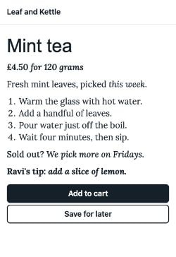 2,964 ms
 3,249 ms
- Lora files8
- Lora bytes177,736
- Words on the screen1,232 ms
- Text in its final font2,964 ms
- Times the text changed its look7
- Last Lora file inlora-latin-500-italic.woff2 at 2,945 ms
- Caveat in the heading3,249 ms
- Last font file incaveat.woff2 at 3,227 ms
- CLS0.0028
Each frame is one Chrome drew. Watch the price, the note and the tip: they change as each font file arrives.
Why it matters: each style costs a file. The files share the line, so more files also push back the fonts that matter most, like Caveat in the heading.
A missing weight borrows a near one
What if Ravi sends fewer files than the text asks for? The browser picks the nearest face it has. The spec gives the rule. For a weight above 500, heavier faces come first: "weights greater than or equal to the desired weight are checked in ascending order". For a weight from 400 to 500, it tries faces up to 500 first, then lighter ones, then heavier ones.
The course drew four weights with one, two and four of Lora's files. Then it asked DevTools which face drew each one:
// Four weights, with only Lora's 400 and 700 files: the face DevTools listed for eachconst drawnWith = { 400: "Lora-Regular", 500: "Lora-Regular", 600: "Lora-Bold", 700: "Lora-Bold" }; for (const [weight, face] of Object.entries(drawnWith)) { console.log(`font-weight: ${weight} drew with ${face}`);}- Line 2 holds what DevTools listed with two files, 400 and 700.
- Lines 4 to 6 print one line per weight. They print
font-weight: 500 drew with Lora-Regularandfont-weight: 600 drew with Lora-Bold, among others.
So 500 borrowed the regular face, and 600 the bold one. On screen, Meera's four weights were two. With only one file, all four drew with the regular face. Here are all three cases:
Why it matters: a missing weight isn't an error. It borrows a face, so the design gets fewer weights than it asked for. Ask which weights readers can really tell apart.
Or one variable file for every weight
Lesson 20.2 met variable fonts: one file that holds a whole range of weights. Lora comes as one too: one file for upright, one for italic.
// Lora's Latin files, from Fontsource (bytes)const staticFiles = [21148, 22756, 21900, 23376, 21916, 23340, 21044, 22256];const variableFiles = [37788, 40772];const sum = (files) => files.reduce((total, bytes) => total + bytes, 0); console.log(`8 static files: ${sum(staticFiles)} bytes`);console.log(`2 variable files: ${sum(variableFiles)} bytes`);- Line 2 is the eight static files' sizes, in bytes. Line 3 is the two variable files.
- Line 4 adds up a list.
- Lines 6 and 7 print
8 static files: 177736 bytesand2 variable files: 78560 bytes.
With the two variable files, the text was final at 2,497 ms. That's 467 ms sooner than with eight files, and still 1,232 ms after the system page. Lesson 20.2 also warned that a variable file is usually bigger than any one static file. The last section has a playground for that balance.
Faux bold and italic when a file is missing
Look again at the page with one Lora file. Its price and tip ask for bold, and some of its words for italic. But Ravi sent only the regular file. DevTools listed that one file for every part of the text. So where did the bold and the italic come from?
The browser made them. The CSS Fonts spec calls this synthesis: making a missing style from a face that's there. A browser might "synthesize a bold face by drawing a thin stroke around each glyph". A glyph is the drawn shape of one letter. For italic, it slants the upright letters. Made-up styles like these are called faux bold and faux italic. Faux means fake.
Ravi writes the specials board with one chalk pen. To make a word bold, he goes over it a second time. To make it slant, he tilts his hand. It works. But a sign painter's bold letters, and real slanted handwriting, look better.
- In real life: One chalk pen
- In fonts: Lora's regular file
- In real life: Going over a word again
- In fonts: Faux bold: a thin stroke around each letter
- In real life: Tilting his hand
- In fonts: Faux italic: the upright letters, slanted
- In real life: A sign painter's bold and slanted letters
- In fonts: Real bold and italic files
When does Chrome fake bold? Chromium's source decides it in a few lines. The text has to ask for weight 600 or more, and the family's heaviest face has to be under 600. That's why, in the last picture, 500 stayed plain regular with one file. Italic is faked when the family has no sloped face at all.
How good is the fake? The course drew a bold phrase and an italic phrase in Lora three ways, at 32 px:
The spec is honest about it. Synthesis "does not meet the level of quality of a face designed for the purpose." In the screenshots, the faux bold is only a little darker. The faux italic is the same letters, slanted. The real italic has letters of its own. Look back at the opening picture too. On the one-file page, the price and the tip look almost regular once Lora arrives. The widths tell you more:
// "Ravi's tip" at 32px, measured with Lora's files (px wide)const regular = 131.75;const fauxBold = 131.75;const realBold = 138.5; console.log(`Faux bold: ${(fauxBold - regular).toFixed(2)} px wider than regular`);console.log(`Real bold: ${(realBold - regular).toFixed(2)} px wider than regular`);- Lines 2 to 4 are the bold phrase's width: in regular, in faux bold, and in real bold.
- Lines 6 and 7 print
Faux bold: 0.00 px wider than regularandReal bold: 6.75 px wider than regular.
The fake keeps the regular letters' widths. The real bold is wider. So a line laid out in faux bold can grow when the real file arrives. That's a font swap moving the page, as in lesson 20.3. The italic went the other way: 140.75 px faked, and 135.23 px real.
Turning the fakes off
The font-synthesis property says which styles the browser may fake. Its starting value lets it fake them all.
p, li { font-family: "Lora", serif; font-synthesis: none;}Line 3, font-synthesis: none, tells the browser not to fake any style. Bold text with no bold file then draws in regular. Italic text with no italic file stays upright. You can also allow one kind only: font-synthesis: style allows faux italic, but no faux bold.
MDN gives one reason to turn faking off. In Chinese, Japanese and Korean, faked styles "might impede the legibility or change the meaning of the text."
Try all three in your own browser, with Lora's files from this site:
Ravi's tip
this week
Ravi's tip
this week
- StatusLoading Lora's files
This runs in your own browser, with Lora's files from this site. The first line asks for bold, the second for italic. The grey lines underneath are the same words in regular, for comparison.
Why it matters: a missing file doesn't break the page, because the browser fakes the style. But the fake looks worse, and the real file can still move the text when it comes. Send the styles the design depends on, or design without them.
Talking with designers about fonts
Meera chose Lora for a reason: it looks like the shop. Ravi doesn't want to just say no. He wants her to choose with the price in front of her.
At a restaurant, you can order anything you like. But the menu shows each price, so you choose knowing the bill. A menu with no prices leads to a surprise at the end.
- In real life: The dishes
- In fonts: The fonts and their styles
- In real life: The price next to each dish
- In fonts: Bytes, files, and when the text is final
- In real life: Reading the menu together
- In fonts: Looking at the recordings with the designer
- In real life: The bill
- In fonts: What the visitor's phone waits for
So Ravi makes a menu from the recordings. Read each row across: one way to set the text, and what it cost on Asha's phone.
| The text's font | Font files for the text | Bytes for the text | Text final at | Caveat in the heading at |
|---|---|---|---|---|
| A system font stack | None. | 0 bytes. | 1,265 ms, at the first paint. | 2,238 ms. |
| Lora, regular only | 1 file. | 21,148 bytes. | 2,051 ms. | 2,339 ms. |
| Lora, eight static files | 8 files. | 177,736 bytes. | 2,964 ms, after 7 changes. | 3,249 ms. |
| Lora, two variable files | 2 files. | 78,560 bytes. | 2,497 ms, after 2 changes. | 2,672 ms. |
Most of the web pays some of this price. The Web Almanac measures millions of pages each year. In its 2025 data, web fonts were on about 88% of sites. The median page, the one in the middle, asked for 4 font files. On phones, the busiest tenth of pages asked for 9 or more. About 9% of mobile pages listed system-ui.
Then Ravi and Meera ask a few questions together:
- Which text carries the brand? A heading or a slogan may need the web font. Long text may not.
- Which styles do the pages really use? Count them on the real pages, not in the font's catalogue.
- Can readers tell the weights apart? With two files, 500 looked like 400, and 600 like 700.
- Static files or a variable font? It depends on how many styles you keep. The playground below shows the balance.
- What shows before the font arrives? That's the fallback, from lesson 20.3.
Pick a set of styles to see what it costs as static files and as variable ones:
- Static files, one per style8 files, 177,736 bytes
- Variable files2 files, 78,560 bytes
- Fewer bytesThe variable files
Static files have one style each. Lora's variable files hold every weight: one file for upright, one for italic. Pick the styles the design really uses.
Ravi and Meera read the menu together. They keep Caveat for the heading: it's the shop's handwriting, and it's one file. The text goes in the system font stack. It was final at the first paint. On the recording Mac, the system font had a real face for every style Meera wanted. Meera asks for one thing: the tip stays bold. On the system page, it already was.
Why it matters: designers choose fonts for good reasons. Show them the cost in their own terms: what the visitor sees, and when. Then you decide together.
Web font or system font?
For each piece of text, ask what the font itself adds. Is it the brand, or just easy reading?
- The shop's handwritten heading
- A short slogan that must look the same on every device
- Long product descriptions and brewing steps
- Buttons, menus and form fields
- A design that asks for eight styles, on pages that use three
- Semibold and bold that readers can't tell apart
Sort each piece of text into the choice that suits it.
Common mix-ups
- "system-ui is one font." No. It names each device's own interface font: San Francisco on a Mac, Segoe UI on Windows, Roboto on Android.
- "Eight @font-face rules download eight files." No. The browser downloads a face only when some text on the page uses its style.
- "Without a bold file, bold text shows as regular." No. Chrome fakes bold from weight 600 up, unless font-synthesis says not to.
- "Faux bold is as good as the real bold." No. It was only a little darker, and kept the regular widths. The real bold was 6.75 px wider.
- "Four weights in the CSS means four weights on screen." No. With only a 400 and a 700 file, 500 drew as regular and 600 as bold.
- "ui-serif works in every browser." No. Only Safari supports the ui- families. Always put another font after one.
Practice exercises
Answer each one first, then open the hints if you need them.
Meera keeps only regular and italic. What does the last line print?
// Lora's regular and italic Latin files (bytes)
const regular = 21148;
const italic = 22756;

console.log(`2 files, ${regular + italic} bytes`);2 files, 43904 bytes. Regular and italic are two styles, so two static files. Lora's two variable files would be 78,560 bytes, so for these two styles the static files are smaller.
The page has Lora's 400 and 700 files. Some text asks for 300. What does the last line print?
// The CSS rule for a weight under 400: lighter faces from the heaviest down, then heavier ones from the lightest up
const faces = [400, 700];
const wanted = 300;
const lighter = faces.filter((weight) => weight <= wanted).sort((a, b) => b - a);
const heavier = faces.filter((weight) => weight > wanted).sort((a, b) => a - b);

console.log(`font-weight: ${wanted} uses the ${[...lighter, ...heavier][0]} face`);font-weight: 300 uses the 400 face. Under 400, the spec tries lighter faces from the heaviest down, then heavier ones from the lightest up. There are no lighter ones, so 400 comes first.
On the recorded page with eight Lora files, which file finished last?
lora-latin-500-italic.woff2, the medium italic file. The eight files all started together and shared the line, so they finished within about 100 ms of each other.
Ravi's price asks for 600, but it draws exactly like the regular text. Which line makes it plain?
@font-face {
  font-family: "Lora";
  src: url("lora-latin-400-normal.woff2") format("woff2");
  font-weight: 400;
  font-style: normal;
  font-display: swap;
}
p, li { font-family: "Lora", serif; font-synthesis: none; }
.price { font-weight: 600; }@font-face {
font-family: "Lora";
src: url("lora-latin-400-normal.woff2") format("woff2");
font-weight: 400;
font-style: normal;
font-display: swap;
}
p, li { font-family: "Lora", serif; }
.price { font-weight: 600; }Line 8. font-synthesis: none stops Chrome faking bold, and there's no file for 600, so the price draws in regular. Better still, add Lora's 600 file, so the price gets a real semibold.
DevTools also lists each font's PostScript name: a second name, stored inside the font file. In the playground on this page, which PostScript name does it list for the real italic phrase?
Lora-Italic. DevTools lists the face that really drew the text: Lora's own italic file, as a network resource. With the regular file only, it lists the regular face instead.
GitHub's Primer lists one font before its system fonts in its sans-serif stack. Which one?
Mona Sans VF, GitHub's own variable font. Primer puts it first, then a system font stack. So GitHub uses a web font, with the system fonts as its fallback.
Check your understanding
For each question, ask whether the font is already on the device, and which style the text asks for.
Question 1 of 7What does this font stack pick in an old Windows browser?
Read the code, then predictconst stack = ["system-ui", "Segoe UI", "Roboto", "sans-serif"]; const oldWindowsBrowser = new Set(["Segoe UI", "Arial", "sans-serif"]); console.log(stack.find((font) => oldWindowsBrowser.has(font)));Choose an answer to see the explanation.
Question 2 of 7What does the generic family system-ui name?
Choose an answer to see the explanation.
Question 3 of 7Why do font stacks end with a family like sans-serif?
Choose an answer to see the explanation.
Question 4 of 7A page has only Lora's regular file. Some text asks for font-weight: 500. What does Chrome draw?
Choose an answer to see the explanation.
Question 5 of 7In the recording, which page's text was in its final font at the first paint?
Choose an answer to see the explanation.
Question 6 of 7A stylesheet has eight @font-face rules for Lora, but the page's text uses only regular and bold. How many Lora files download?
Choose an answer to see the explanation.
Question 7 of 7The bold file is missing, and the text has font-synthesis: none. How does bold text look?
Choose an answer to see the explanation.
Key takeaways
- A system font is already on the device. A stack like system-ui, sans-serif costs no bytes, and the text never swaps.
- system-ui is San Francisco on a Mac, Segoe UI on Windows and Roboto on Android. End every stack with a generic family.
- Each style of a static font is one file, downloaded only if some text uses it. Eight files kept the text changing until 2,964 ms.
- A missing weight borrows a near face. Chrome fakes bold from 600 up, and fakes italic; font-synthesis can turn that off.
- Show designers the cost: bytes, files, and when the text is final. Keep web fonts for the text that carries the brand.
Remember the one-liner.
Use the hotel's towels when they do the job: a system font is final from the first paint, and a web font must earn every file.
Sources
The facts on this page come from these standards, docs, data and source code:
- Best practices for fonts: use fewer web fonts, web.dev.
- CSS Fonts Module Level 4: generic font families, W3C.
- Fonts for Apple platforms, Apple.
- DevTools: PlatformFontsWidget.ts, the Rendered fonts section, the Chrome DevTools project.
- Web Almanac 2025, Fonts: generic and system fonts, HTTP Archive.
- Reboot: native font stack, Bootstrap.
- font-family, MDN.
- Primer primitives 11.10.0: font-stack.json5, GitHub.
- CSS Fonts Module Level 4: font loading guidelines, W3C.
- CSS Fonts Module Level 4: the font matching algorithm, W3C.
- Lora, Fontsource.
- CSS Fonts Module Level 4: controlling synthetic faces, W3C.
- Chromium 157: css_segmented_font_face.cc, when Chrome fakes bold and italic, the Chromium project.
- Chromium 157: font_selection_types.h, the bold threshold, the Chromium project.
- font-synthesis, MDN.
- Web Almanac 2025, Page Weight: fonts request volume, HTTP Archive.
Coming next: Delivering CSS. The fonts are done. Next, the stylesheet itself: how to get the CSS a page needs to it fast.