Paint and layers
What makes a paint slow, when a layer of its own helps, and what layers cost: shadows, filters, will-change, layer explosions, and the tools that find them.
- 01Spot effects that are slow to drawTell which effects cost paint, which make Chrome paint more, and which cost every frame.
- 02Use layers wellGive a layer to what changes often, and see when one layer turns into many.
- 03Find paint problemsUse paint flashing, Layer borders, the Layers panel and the paint profiler on a real page.
One vote, 999 see-through buttons
Asha is reading Leaf and Kettle's mint tea reviews again. Ravi's page still holds all 1,000 of them. She scrolls to Ben's review, the one with the photo of his tea, and taps Helpful.
Ravi has brought back his fade from lesson 31.1. When Asha votes, her button turns green. Every other Helpful button turns half see-through, so she can see which one she picked. Here is what she saw, in real frames from Chrome, and what Chrome did in between:
Here are the main numbers as code:
// Asha taps Helpful on Ben's review, from Chrome's trace.// Times are in milliseconds (ms) after her tap.const tap = { styleMs: 90, restyled: 1001, layoutMs: 17.5, paintMs: 1.9, fadedFrame: 194.6 }; console.log(`The faded buttons were on screen at ${tap.fadedFrame} ms.`);console.log(`Recalculate style: ${tap.styleMs} ms for ${tap.restyled} elements.`);console.log(`Layout: ${tap.layoutMs} ms. Paint: ${tap.paintMs} ms.`);- Lines 1 and 2 are comments. A millisecond (ms) is a thousandth of a second.
- Line 3 holds what Chrome's trace recorded. A trace is Chrome's detailed record of everything it did, as in lesson 7.2.
- Line 5 prints
The faded buttons were on screen at 194.6 ms. - Line 6 prints
Recalculate style: 90 ms for 1001 elements.Line 7 printsLayout: 17.5 ms. Paint: 1.9 ms.
Recalculate style works out every element's final styles, as in lesson 31.1. Layout works out the size and place of every box.
Lesson 31.1 left a puzzle here. Its Selector Stats showed that matching the fade's selector took only 1.9 ms. So most of the Recalculate style went on something else. This recording measured 90 ms. Lesson 31.1's measured 77.4 ms: times change from one recording to the next. Now look at Paint. Painting the faded buttons took 1.9 ms too. The time went on getting ready to draw them.
To see why, you need two ideas from lesson 6.3:
- Paint is the step where Chrome writes a list of drawing commands, like "fill this box green". Raster then turns the list into pixels, off the main thread.
- A layer is a part of the page that Chrome draws on its own. Then it stacks the layers into one frame, like see-through sheets on a projector.
Chrome keeps two kinds of layers:
- Composited layers are the sheets from lesson 6.3. The compositor stacks them. DevTools' Layers panel shows them, as in lesson 7.5.
- Paint layers belong to Blink, Chrome's rendering engine. Each one is a part of the page that Blink paints in a set order. DevTools doesn't show them, but they still take time to make.
Leaf and Kettle's window has a painted sign. The price of the day goes on a clear sheet hung in front of the glass. To change the price, the sign writer swaps the sheet and leaves the window alone. But each sheet must be cut, hung in the right order and stored. Ask him for 999 sheets, and he spends the day hanging them, not painting.
- In real life: Painting the window
- In JavaScript: Paint: the drawing commands for the page
- In real life: A clear sheet hung in front
- In JavaScript: A layer
- In real life: Swapping one sheet, leaving the window alone
- In JavaScript: Changing a layer without painting the page again
- In real life: Cutting, hanging and storing each sheet
- In JavaScript: Making, placing and keeping each layer in memory
Drawing a change costs more than Paint. Some looks are slow to draw, and some make Chrome draw much more. A layer can save drawing, but every layer has to be made, placed, kept and stacked.
So Ravi has four questions. Which looks are slow to draw? When does a layer of its own help? When does one layer turn into many? And why did his fade cost 90 ms? This lesson answers all four, with real recordings.
How the course recorded it
- The browser: Chrome 157, on a screen the size of Asha's phone: 412 by 823 px. Its CPU was slowed 4 times, as in lesson 31.3. That slowdown applies to the page's main thread only. Raster and the GPU process ran at the computer's full speed.
- The pages: Ravi's page from lesson 31.3, with 1,000 reviews. Each version adds a few CSS rules. For the fade, the course also built pages of 250, 500 and 2,000 reviews.
- The changes: the opening tap was a real mouse click. The course made every other change 9 times, with JavaScript in the page, and kept the middle one.
- The layers: the course read them the way DevTools' Layers panel does, through the DevTools protocol.
- The times: they come from the course's own computer, so yours will differ.
Shadows, filters and blurs: what they cost to draw
Ravi wants softer cards. A friend suggests a big, soft shadow under each one. web.dev warns that "anything that involves a blur (like a shadow, for example) is going to take longer to paint than, say, drawing a red box." So Ravi tries three looks, each on its own copy of the page:
/* Version 1: a soft shadow under every card */.review { box-shadow: 0 8px 40px rgb(0 0 0 / 0.35); }/* Version 2: the same shadow, made with a filter */.review { filter: drop-shadow(0 8px 20px rgb(0 0 0 / 0.35)); }/* Version 3: a see-through header that blurs what's behind it */header { background-color: rgb(47 93 70 / 0.75); backdrop-filter: blur(12px); }- Line 2 gives every card a shadow with
box-shadow. The third length, 40px, is the blur: the shadow fades out softly over about that distance. - Line 4 makes the same kind of shadow with a filter. A filter changes how the whole card looks after it's drawn.
drop-shadow()blurs a copy of the card's shape. - Line 6 makes the header see-through.
backdrop-filterblurs whatever scrolls under it, like frosted glass.
Meera writes the specials on the café's chalkboard. A box is one stroke of chalk. A soft shadow means smudging with her thumb, round and round. Now say she copies the whole menu onto a second board, smudges that, and props it behind. Then she has to copy every item first, even the ones nobody reads.
- In real life: One stroke of chalk
- In JavaScript: A plain card: one drawing command
- In real life: Smudging with a thumb
- In JavaScript: A blur: each pixel mixes with the pixels around it
- In real life: Copying the menu onto a second board first
- In JavaScript: A filter: the card is drawn on its own, then changed as a whole
- In real life: Copying every item, read or not
- In JavaScript: Painting every card, near the screen or not
Asha taps Night reading on each version. Every colour changes, so Chrome paints everything near the screen again. Here is what Paint and Layerize took. Layerize is the step that splits the drawing into layers, from lesson 6.3.
// Asha taps Night reading on each version. Middle of 9 taps each.const taps = [ { page: "plain cards", paintMs: 1.2, layerizeMs: 0.057 }, { page: "box-shadow", paintMs: 1.5, layerizeMs: 0.063 }, { page: "filter: drop-shadow()", paintMs: 20.2, layerizeMs: 9.3 }, { page: "backdrop-filter header", paintMs: 1.9, layerizeMs: 0.3 },];for (const t of taps) { console.log(`${t.page}: Paint ${t.paintMs} ms, Layerize ${t.layerizeMs} ms`);}- Lines 3 to 6 hold the middle tap of each version.
- Line 9 prints
plain cards: Paint 1.2 ms, Layerize 0.057 msandbox-shadow: Paint 1.5 ms, Layerize 0.063 ms. - Then
filter: drop-shadow(): Paint 20.2 ms, Layerize 9.3 msandbackdrop-filter header: Paint 1.9 ms, Layerize 0.3 ms.
A box-shadow cost little here
The big shadow added 0.3 ms of Paint. To see why, the course used DevTools' paint profiler. It replays a layer's drawing commands one by one, and times each one. On the plain page, the main layer held 321 commands. With the shadows, it held 559.
Each card near the screen gained seven commands: one draws the shadow, and the others clip it and shift it down. In the replay, the rounded boxes took 3.6 ms, against 1 ms on the plain page. Why it matters: a soft shadow on a few dozen cards is fine. Measure before you take it away.
A filter made Chrome paint every card
The filter cost much more: 20.2 ms of Paint and 9.3 ms of Layerize, in every tap. The paint profiler shows why. The main layer now held 11,261 drawing commands. Among them were 1,000 saveLayer commands, one for each card. A saveLayer starts a separate drawing, so the filter can change the card as a whole.
One for each card: all 1,000 of them. Normally, Chrome paints only the part of the page near the screen. That area is the cull rect: the screen, and a margin around it. Chrome sets that margin at 4,000 px on computers, and 2,000 px on Android.
But Blink's source makes an exception: "Cull rects and clips can't be propagated across a filter which moves pixels". blur() and drop-shadow() move pixels: they spread a card's colour outside the card. So Blink paints such a card whole, wherever it is.
Why it matters: a blur filter on many elements makes every repaint cover all of them. For a soft shadow, box-shadow's Paint was 13 times shorter here.
backdrop-filter costs in every frame
The see-through header didn't change Paint. In the paint profiler, the header drew the same 9 commands as before, only in a see-through green. The blur isn't in the drawing at all. In the Layers panel, the header's layer gives a new reason: "Has a backdrop filter."
The blur happens when the compositor builds each frame, in the GPU process. So the course swiped a finger 1,600 px down both pages, and timed the GPU process. Its main thread was busy for 64.7 ms instead of 20.6 ms. Drawing the 126 frames took 12.3 ms instead of 1.3 ms.
Why it matters: a blur behind a header is paid while the visitor scrolls, in every frame, in the GPU process. Try scrolling on a real phone before you keep it.
Compare the four versions:
/* No extra rule: Ravi's plain cards */23.2 ms4.2 ms1.2 ms0.057 ms0.88 ms1.3 ms32120.6 msChrome painted only the cards near the screen: those within 4,000 px of it.
A layer of its own: will-change
Remember Ravi's reading line from lesson 31.1? A green line under the header grows as Asha reads. His first version draws it with the header's background:
header { background: linear-gradient(#8fd3a8, #8fd3a8) left bottom / var(--read, 0%) 4px no-repeat, #2f5d46; }Line 1 draws a 4 px line along the bottom of the header, as wide as --read. Ravi's script sets --read as Asha scrolls. Each time the line grows, Chrome paints the whole header again. Paint flashing, from lesson 7.5, shows it: the whole header flashed green.
Ravi tries a second version. The line gets an element of its own, and will-change:
.read-line { position: absolute; left: 0; bottom: 0; width: 100%; height: 4px; background-color: #8fd3a8; transform: scaleX(var(--read, 0)); transform-origin: left; will-change: transform;}- Line 2 places a 4 px line along the bottom of the header.
- Line 3 colours it green.
- Line 4 stretches it to the width
--readasks for, withtransform.scaleX(0.4)makes it 40% as wide. - Line 5 asks for a layer:
will-change: transform.
will-change tells the browser what you're about to change, so it can get ready. The spec calls it "a rendering hint". In Chrome, will-change: transform gives the element a composited layer of its own. Giving an element its own layer is called promoting it.
Ben phones the café: "I'll come at seven." The staff set a table for him, so he sits down at once. Now say he books a table for every friend in his phone, just in case. The café fills with set tables that nobody sits at.
- In real life: Phoning to say "I'll come at seven"
- In JavaScript: will-change: transform
- In real life: The table, set before he arrives
- In JavaScript: A layer made before the change
- In real life: Sitting down at once
- In JavaScript: The change needs no paint
- In real life: A table for every friend in his phone
- In JavaScript: will-change on every element
The course moved the line from 40% to 60%, in both versions:
// Ravi's line grows from 40% to 60%. Middle of 9 moves each.const moves = [ { line: "in the header's background", paintMs: 1.8, prePaintMs: 0.022 }, { line: "on a layer of its own", paintMs: 0, prePaintMs: 3.3 },];for (const m of moves) { console.log(`The line ${m.line}: Paint ${m.paintMs} ms, Pre-paint ${m.prePaintMs} ms`);}- Line 3 is the line in the header's background. Line 4 is the line on its own layer.
- Line 7 prints
The line in the header's background: Paint 1.8 ms, Pre-paint 0.022 ms. - Then
The line on a layer of its own: Paint 0 ms, Pre-paint 3.3 ms.
On its own layer, the line needed no Paint at all, and no raster. The compositor stretched the layer. With paint flashing on, only 336 pixels changed: the line itself. There was no green box.
But Pre-paint grew to 3.3 ms. Pre-paint gets ready for paint. Chrome's RenderingNG guide says it computes "property trees". They hold the page's transforms, among other things. So the layer saved the paint. On this page, it didn't make the main thread's work smaller. Why it matters: a layer limits what Chrome paints again. Use one for something that changes often, and time the whole frame.
will-change on one card, or on every card
Ravi plans to slide Ben's card in later, so he promotes it. Then he wonders: why not every card?
/* Version 1: Ben's card only */#review-14 { will-change: transform; }/* Version 2: every card */.review { will-change: transform; }// Asha opens each page. Its layers, as DevTools' Layers panel reads them.const pages = [ { willChangeOn: "Ben's card", layers: 6, cardLayers: 1 }, { willChangeOn: "every card", layers: 25, cardLayers: 20 },];for (const p of pages) { console.log(`will-change on ${p.willChangeOn}: ${p.layers} layers, ${p.cardLayers} of them for cards`);}- Lines 3 and 4 hold the layers the course read when Asha opened each page.
- Line 7 prints
will-change on Ben's card: 6 layers, 1 of them for cards. - Then
will-change on every card: 25 layers, 20 of them for cards.
Every card asked for a layer, and only 20 got one. Chrome makes layers from what it paints. It painted only the cull rect: the cards within 4,000 px of the screen.
The Layers panel's memory estimate, from lesson 7.5, counts 4 bytes for every pixel. The 20 card layers added 6.8 MB to it. The tiles Chrome really drew grew from 1.8 MB to 2 MB. Night reading took about as long as before.
So on Ravi's page, Chrome kept the cost small. In lesson 6.3, each of 1,000 boxes got a layer, and commit took about ten times as long. The spec is plain: "Don't Spam will-change Across Too Many Properties or Elements". Why it matters: promote the few elements that really move, and take will-change off when they stop.
Layer explosions: when one layer makes many
A layer explosion is when a page ends up with many more layers than anyone asked for. Here's how one happened on Ravi's page.
Ravi adds a small leaf next to the title. It sways gently, with a CSS animation. He also plans a "+1" that pops up above a Helpful button when it's tapped. For that, each button needs position: relative:
.leaf { position: absolute; top: 64px; right: 28px; width: 24px; height: 24px; border-radius: 0 100%; background-color: #6aa77c; }@media (prefers-reduced-motion: no-preference) { .leaf { animation: sway 1.5s ease-in-out infinite alternate; }}@keyframes sway { from { transform: rotate(-15deg); } to { transform: rotate(15deg); } }.helpful { position: relative; }- Line 1 draws the leaf: a small green shape in the top right corner of the title.
- Lines 2 to 4 make it sway, but only for visitors who haven't asked their system for less motion.
- Line 5 describes the sway: a turn from -15 to 15 degrees, with transform.
- Line 6 makes every Helpful button positioned, ready for the "+1".
// Asha opens each page. Its layers, as DevTools' Layers panel reads them.const pages = [ { page: "the leaf alone", layers: 6, buttonLayers: 0 }, { page: "position: relative on every button", layers: 26, buttonLayers: 20 }, { page: "the same, with z-index: 1 on the leaf", layers: 6, buttonLayers: 0 },];for (const p of pages) { console.log(`${p.page}: ${p.layers} layers, ${p.buttonLayers} for buttons`);}- Lines 3 to 5 hold the layers of three pages: the leaf alone, the leaf with the positioned buttons, and a fix you'll see below.
- Line 8 prints
the leaf alone: 6 layers, 0 for buttonsandposition: relative on every button: 26 layers, 20 for buttons. - Then
the same, with z-index: 1 on the leaf: 6 layers, 0 for buttons.
One line of CSS on the buttons made 20 new layers. Nobody asked for them. The Layers panel gives each one the same reason: "Overlaps other composited content."
Why each button got a layer
- Paint order. The CSS spec paints "All positioned descendants with 'z-index: auto'" after the normal content, in page order. The leaf comes first, so every button is painted after it, on top of it.
- An animating layer could be anywhere. The leaf has a layer of its own, because it's animating. While it animates, Blink assumes it could move "anywhere". So every button painted after it might overlap it.
- On top must stay on top. A button left in the page's main layer would sit under the leaf's layer. So Chrome gives the button a layer above it.
- Far-apart buttons can't share. Chrome merges layers when it can. But one layer for two buttons a card apart would be mostly empty. Blink refuses a merge that would waste more than 10,000 square pixels.
The cards show the other side. When Ravi made every card position: relative instead, Chrome merged all the cards near the screen into one layer, 380 by 4,911 px. Cards that sit close together can share. Blink's source calls such a shared layer a "squash layer".
The café's noticeboard has a paper fish that a fan keeps swinging around. Notes pinned after it must stay on top of it, so each one goes into a clear sleeve hung in front. Notes close together can share a sleeve. Notes far apart each need their own. Pin the fish last, and no note needs a sleeve.
- In real life: The paper fish that swings around
- In JavaScript: The swaying leaf, on its own layer
- In real life: A note pinned after it
- In JavaScript: A Helpful button painted after the leaf
- In real life: A clear sleeve hung in front
- In JavaScript: A layer above the leaf's layer
- In real life: Notes close together sharing a sleeve
- In JavaScript: Cards merged into one layer
- In real life: Pinning the fish last
- In JavaScript: z-index: 1 on the leaf
The fix: change the paint order
.leaf { z-index: 1; }Line 1 puts the leaf above everything else. The spec paints a positive z-index last. Nothing is painted after the leaf, so nothing can be under it. The 20 button layers were gone: 6 layers, as with the leaf alone.
How much did the explosion cost? The 20 small button layers added only 0.2 MB to the memory estimate. The merged card layer added 7.5 MB. The main thread's work for Night reading was about the same on all three pages. On this page, the explosion was cheap.
Why it matters: the count grows with the page. Every positioned element painted after an animating layer may get a layer of its own. Check Layer borders after you add an animation, and give the moving element a z-index that keeps it on top.
Back to the fade: 999 paint layers
Now the opening puzzle. Here is Ravi's fade from lesson 31.1:
.helpful.voted { background-color: var(--accent); color: var(--card); }#reviews:has(.voted) .helpful:not(.voted) { opacity: 0.5; }Line 1 colours the button Asha voted for. Line 2 makes every other Helpful button half see-through, once one button in the list has the class voted.
The CSS Color spec says: "If a box has opacity less than 1, it forms a stacking context for its children." A stacking context is a group the browser paints as one, so nothing outside can slip between its parts. A see-through button is drawn whole first, then faded as a whole. A filter, a backdrop-filter and isolation: isolate make stacking contexts too.
In Blink, every box that forms a stacking context gets a paint layer. So when Asha voted, Blink had to make 999 paint layers. It made them during Recalculate style.
Each new paint layer looks for its place
Blink keeps paint layers in a tree, in page order. A new one must go just before the next paint layer after it in the page. To find that one, Blink's FindNextLayer looks at everything after the button: the rest of its card, then every card below, one box at a time.
Blink restyles the page from top to bottom. So when it made the first button's layer, none of the buttons below had one yet. The search went through every card to the end of the page. The second button's search did the same, minus one card. And so on, 999 times.
Ravi keeps the reviews in a ring binder, one per page. He adds a divider in front of each review with a vote. A divider goes just before the next divider. So for each one, he flips forward, page by page, looking for the next. There are none yet, so every time he flips to the end.
- In real life: A new divider
- In JavaScript: A new paint layer
- In real life: Flipping forward to the next divider
- In JavaScript: FindNextLayer searching the page after the button
- In real life: No dividers yet further on
- In JavaScript: The buttons below don't have their layer yet
- In real life: A divider at the end of each chapter
- In JavaScript: isolation: isolate on each card
If that's right, twice the reviews should take about four times as long. The course timed the vote on four page sizes:
// The same vote on pages of four sizes. Middle of 9 votes each.const pages = [ { reviews: 250, styleMs: 7.6 }, { reviews: 500, styleMs: 25.7 }, { reviews: 1000, styleMs: 89.1 }, { reviews: 2000, styleMs: 342.8 },];for (let i = 1; i < pages.length; i++) { const times = pages[i].styleMs / pages[i - 1].styleMs; console.log(`${pages[i].reviews} reviews: ${times.toFixed(1)} times as long as ${pages[i - 1].reviews}`);}- Lines 3 to 6 hold the vote's Recalculate style on pages of 250, 500, 1,000 and 2,000 reviews.
- Line 9 divides each time by the one before it.
- Line 10 prints
500 reviews: 3.4 times as long as 250and1000 reviews: 3.5 times as long as 500. - Then
2000 reviews: 3.8 times as long as 1000.
Twice the reviews took nearly four times as long: twice the buttons, each searching about twice as far. Taking the vote back grew only twice as fast: 7.5 ms for 1,000 reviews, 13.4 ms for 2,000. Removing a paint layer needs no search.
And the Layout in Asha's tap? Blink's source asks for an element to be laid out again whenever it starts or stops being a stacking context. So every faded button was laid out again.
Two fixes
/* Fix 1: fade with a paler colour */#reviews:has(.voted) .helpful:not(.voted) { color: #97aea2; border-color: #97aea2; }/* Fix 2: keep the see-through fade, and isolate each card */.review { isolation: isolate; }- Line 2 fades the other buttons with a paler colour. A colour doesn't make a stacking context.
- Line 4 keeps the see-through fade, but makes every card a stacking context first. Each card then has a paint layer, so a button's search stops at the end of its card.
// Three ways to fade, on the 1,000-review page. Middle of 9 votes each.const fades = [ { fade: "opacity: 0.5", styleMs: 89.1, layoutMs: 18 }, { fade: "a paler colour", styleMs: 7.4, layoutMs: 0 }, { fade: "opacity, each card isolated", styleMs: 6.6, layoutMs: 17.8 },];for (const f of fades) { console.log(`${f.fade}: style ${f.styleMs} ms, layout ${f.layoutMs} ms`);}- Lines 3 to 5 hold each fade's middle vote.
- Line 8 prints
opacity: 0.5: style 89.1 ms, layout 18 msanda paler colour: style 7.4 ms, layout 0 ms. - Then
opacity, each card isolated: style 6.6 ms, layout 17.8 ms.
The paler colour took 12 times less style, and no layout at all. Isolating the cards brought style down just as far, which fits the search. But it still needed the layout.
So lesson 31.1's clue was right: the cost came from what opacity means for drawing. But it wasn't the drawing. Paint took 1.9 ms. The time went on making 999 paint layers, and on laying the buttons out again. Why it matters: to fade many things at once, change their colour. Save opacity for one element, or for an animation on its own layer.
Compare every fade the course recorded:
#reviews:has(.voted) .helpful:not(.voted) { opacity: 0.5; }89.1 ms, 1,001 elements18 ms7.8 ms1.7 ms7.5 ms28.7 msEach see-through button gets a paint layer, and each new layer searches the cards below it for its place.
Then time the two fades in your own browser:
#reviews:has(.voted) .helpful:not(.voted) { opacity: 0.5; }107 msnot timed yetIn Chrome, each see-through button gets a paint layer, and the buttons are laid out again.
Finding paint problems
Five tools find everything in this lesson. You met most of them in lessons 7.2 and 7.5. Read the table across: your question, the tool, and what it showed on Ravi's page.
| Your question | The tool | On Ravi's page |
|---|---|---|
| What did Chrome paint again? | Paint flashing, in the Rendering tab. | The whole header flashed each time the line grew. |
| Where are the layers? | Layer borders, in the Rendering tab. | An orange box went round every positioned Helpful button. |
| Why does a layer exist, and what does it cost? | The Layers panel's Details pane. | Each button layer said it overlaps other composited content. |
| How long did each step take? | The Performance panel. | Paint took 20.2 ms with the filter, and 1.2 ms without. |
| Which drawing command is slow? | The paint profiler. | The filter added a saveLayer command for every card. |
The paint profiler needs one setting. In the Performance panel's capture settings, check Enable advanced paint instrumentation, then record. Select a Paint event, and DevTools shows its paint profiler. The Layers panel has one too: check Paints, select a layer, and click Paint Profiler.
Paint flashing shows what was painted, not how long it took. So start there, then ask the Performance panel how long, and the paint profiler which command. Pick a tool to see what it showed on Ravi's page:
// What the Paint flashing box sends
Overlay.setShowPaintRects({ result: true });20,1881.8 ms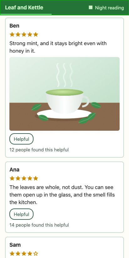
The green box is everything Chrome painted again: the whole header, for a 4 px line.
Which fix fits?
Here are problems like Ravi's. For each one, ask: is the drawing slow, does something change often, or is one layer making many?
- A soft shadow made with
filter: drop-shadow()on 500 product cards - Fading 999 Helpful buttons with
opacitywhen one is tapped - A
backdrop-filterheader on a phone whose scrolling stutters - A progress line, drawn by a header's background, that grows on every scroll
- A side menu that slides in when Asha taps a button
will-change: transformon every product card, just in case- A spinning icon painted under 50 badges with
position: absolute
Sort each problem by the fix it needs.
Common mix-ups
- "A blurred box-shadow is always slow." No. On Ravi's cards, a 40 px blur added 0.3 ms of Paint. Measure it first.
- "A filter only costs where it's on the screen." No. A blur or a drop shadow made Chrome paint all 1,000 cards, not just the ones near the screen.
- "backdrop-filter costs time when the page changes." No. Paint didn't change. The GPU process blurred it in every frame of a swipe.
- "will-change on 1,000 cards makes 1,000 layers." No. Chrome made 20, for the cards it painted. The spec still says not to do it.
- "A layer always makes a change cheaper." No. The line on its own layer skipped Paint, but Pre-paint took 3.3 ms.
- "Opacity is the cheap way to fade anything." No. Fading 999 buttons made 999 paint layers: 89.1 ms of style, against 7.4 ms with a colour.
Practice exercises
Answer first, then use the hints.
A Helpful button's layer is 77 by 36 px. What does this print?
// One Helpful button's layer, from the Layers panel
const layer = { width: 77, height: 36 };
const bytesPerPixel = 4;
console.log(layer.width * layer.height * bytesPerPixel);11088 bytes, about 11 KB. Twenty such layers are about 0.2 MB, which is what the explosion added to the estimate.
Four ways to make a button look faded. Which line gives each button a paint layer?
.helpful.a { color: #97aea2; }
.helpful.b { border-color: #97aea2; }
.helpful.c { filter: grayscale(1); }
.helpful.d { background-color: #f4f4f4; }Line 3. A filter other than none makes a stacking context, so each button would get a paint layer, like the opacity fade. The other three only change colours.
In the fades playground, pick 2,000 reviews. How long did the vote's Layout take, in ms?
40.1 ms. Twice the buttons became stacking contexts, so about twice the layout of the 1,000-review page.
Ravi's cards use this filter. Which property gives a similar shadow without making Chrome paint every card?
.review { filter: drop-shadow(0 8px 20px rgb(0 0 0 / 0.35)); }.review { box-shadow: 0 8px 20px rgb(0 0 0 / 0.35); }box-shadow. It draws a similar soft shadow as one command per card, and Chrome paints only the cards near the screen.
Open the course's copy of the leaf page. In the Layers panel, what compositing reason does the leaf's layer give?
"Has an active accelerated transform animation or transition." The sway is a CSS animation of transform, which Chrome runs on the leaf's own layer.
Download the course's trace of Asha's tap. How many nodes needed layout after the vote?
3,002 of 12,017. That's about three layout objects for each faded button: the button, the box inside it, and its text. Each one had just become a stacking context.
Check your understanding
For each question, ask: is it the drawing, the layers, or the frame-by-frame work that costs?
Question 1 of 7In Asha's tap on Helpful, which step took the longest?
Choose an answer to see the explanation.
Question 2 of 7Why did
filter: drop-shadow()on every card make the Night reading tap's Paint so much slower?Choose an answer to see the explanation.
Question 3 of 7Where did the
backdrop-filterheader's blur cost time?Choose an answer to see the explanation.
Question 4 of 7Ravi put
will-change: transformon all 1,000 cards. How many card layers did Chrome make when Asha opened the page?Choose an answer to see the explanation.
Question 5 of 7Next to the swaying leaf, why did each Helpful button with
position: relativeget a layer of its own?Choose an answer to see the explanation.
Question 6 of 7What does this division of two recorded style times print?
Read the code, then predictconst styleMs = { reviews1000: 89.1, reviews2000: 342.8 }; console.log((styleMs.reviews2000 / styleMs.reviews1000).toFixed(1));Choose an answer to see the explanation.
Question 7 of 7Ravi kept the see-through fade but added
isolation: isolateto every card. Why did Recalculate style drop from 89.1 ms to 6.6 ms?Choose an answer to see the explanation.
Key takeaways
- A change can cost far more than its Paint. Asha's fade spent 90 ms in style and 1.9 ms in Paint.
- A box-shadow was cheap here. A blur or drop-shadow filter made Chrome paint every card, near the screen or not.
- backdrop-filter costs on the GPU, in every frame while the page scrolls.
- A layer of its own skips paint for something that changes often. will-change asks for one: use it on the few elements that move.
- Elements painted after an animating layer may each get a layer of their own. A z-index that paints the moving element last stops the explosion.
- opacity, filter and isolation make stacking contexts, and each one a paint layer. Fade many elements with a colour.
- Paint flashing, Layer borders, the Layers panel, the Performance panel and the paint profiler find each problem.
Remember the one-liner.
Blur less, and give layers only to what moves: every layer has to be made, placed, kept and stacked.
Sources
The facts on this page come from these specs, docs and source files:
- Simplify paint complexity and reduce paint areas, web.dev.
- Stick to compositor-only properties and manage layer count, web.dev.
- RenderingNG architecture: pre-paint, paint, layerize and raster, Chrome for Developers.
- thread_cpu_throttler.cc: CPU throttling slows the page's main thread, Chromium source.
- CSS Backgrounds and Borders Level 3: box-shadow's blur, W3C.
- Filter Effects Level 1: the filter property, W3C.
- Filter Effects Level 2: backdrop-filter, W3C.
- View Paint Profiler information, in the Layers panel, Chrome for Developers.
- cull_rect_updater.cc: a filter that moves pixels gets an infinite cull rect, Chromium source.
- filter_operation.h: blur() and drop-shadow() move pixels, Chromium source.
- features.cc: the cull rect reaches 4,000 px past the screen (2,000 on Android), Chromium source.
- compositing_reasons.cc: the reasons the Layers panel shows, Chromium source.
- LayerTreeModel.ts: the Layers panel's reasons and its 4-bytes-a-pixel estimate, DevTools source.
- CSS Will Change Level 1, W3C.
- CSS 2: the painting order of a stacking context, W3C.
- geometry_mapper.cc: an animating layer may be anywhere, Chromium source.
- paint_artifact_compositor.cc: merge with an earlier layer, or overlap it, Chromium source.
- pending_layer.cc: no merge that would waste more than 10,000 square pixels, Chromium source.
- CSS Color Level 4: opacity forms a stacking context, W3C.
- Compositing and Blending Level 1: the isolation property, W3C.
- computed_style.h: the properties that make a stacking context, Chromium source.
- layout_box.cc: a stacking context needs a paint layer, Chromium source.
- paint_layer.cc: a new paint layer finds its place, Chromium source.
- layout_object.cc: FindNextLayer, Chromium source.
- container_node.cc: style is recalculated in page order, Chromium source.
- computed_style.cc: becoming a stacking context needs layout, Chromium source.
- Performance features reference: Enable advanced paint instrumentation, Chrome for Developers.
Coming next: Compositor-friendly animation. Ravi adds his "+1" to the Helpful buttons, and finds out why one way of moving it freezes while the leaf keeps swaying.